

Easy-to-use, flexible, uni-app-based cross-end component library
# 1 Introduction
Press Plus is the business component part separated from Press UI (opens new window). Why should it be separated? The following are A few points to consider.
- The basic component library is already very stable, but the business component library changes frequently and more and more, and there is a risk of affecting the basic components.
- Continuous maintenance of a high-quality component library containing a large number of components is tiring. After separation,
Press UIwill continue to pursue100points, andPress Pluswill pursue95points. - From a user perspective, if users only use basic components, there is no need to download business components. Moreover, as there are more and more business components in the future, the package size will become larger and larger.
# 1.1. Standards
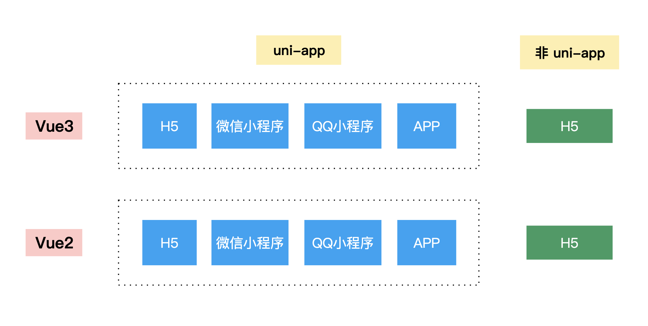
Compared with Press UI, Press Plus will lower the standards in the following aspects:
- Adapt
Vue3according to the needs of the business itself - Adapt to non-uni-app environments according to business needs
- Provide international support based on business needs
The above points are fully supported in Press UI.
Specifications that both Press Plus and Press UI must comply with include:
- Strict coding standards
- BEM specification, and the class name must start with
press - Detailed documentation and rich examples
# 1.2. Transition
Business component transition considerations:
- The business side needs to change the introduction path of business components to
Press Plusas soon as possible Press UIExisting business components will not be deleted before the next major version, ensuring that there are no major changes when the business side upgradesPress UI- Updates of business components must be carried out in
Press Plus.Press UIwill no longer maintain or add new business components.
# 2. Solve pain points
Precipitating the business components in the project into Press Plus has the following benefits:
- Reduce the coupling between business and components, reduce their respective complexity, and reduce bugs
- Enhance component maintainability and improve development efficiency
- By organizing code, merging attributes, separating business logic, etc., we can make components pure, enhance maintainability, and thereby improve efficiency.
- Encapsulate core logic and control changes
- No need to worry about external collaborators changing the code and overwriting issues when resolving conflicts
- Easy to locate UI issues
- The three terminal codes are released at the same time, as well as various types of examples, with full coverage, making it easy to find UI problems and inconsistent performance of the three terminals
- Can improve performance
- Use custom variables in examples to locate performance bottlenecks and solve performance problems
- Improve reusability and can be applied to other projects
- Technology precipitation, technology accumulation, and continuous polishing of component details
# 3. Application scenarios
Press Plus can be applied to uni-app projects or ordinary H5 projects, supporting both Vue2 and Vue3.
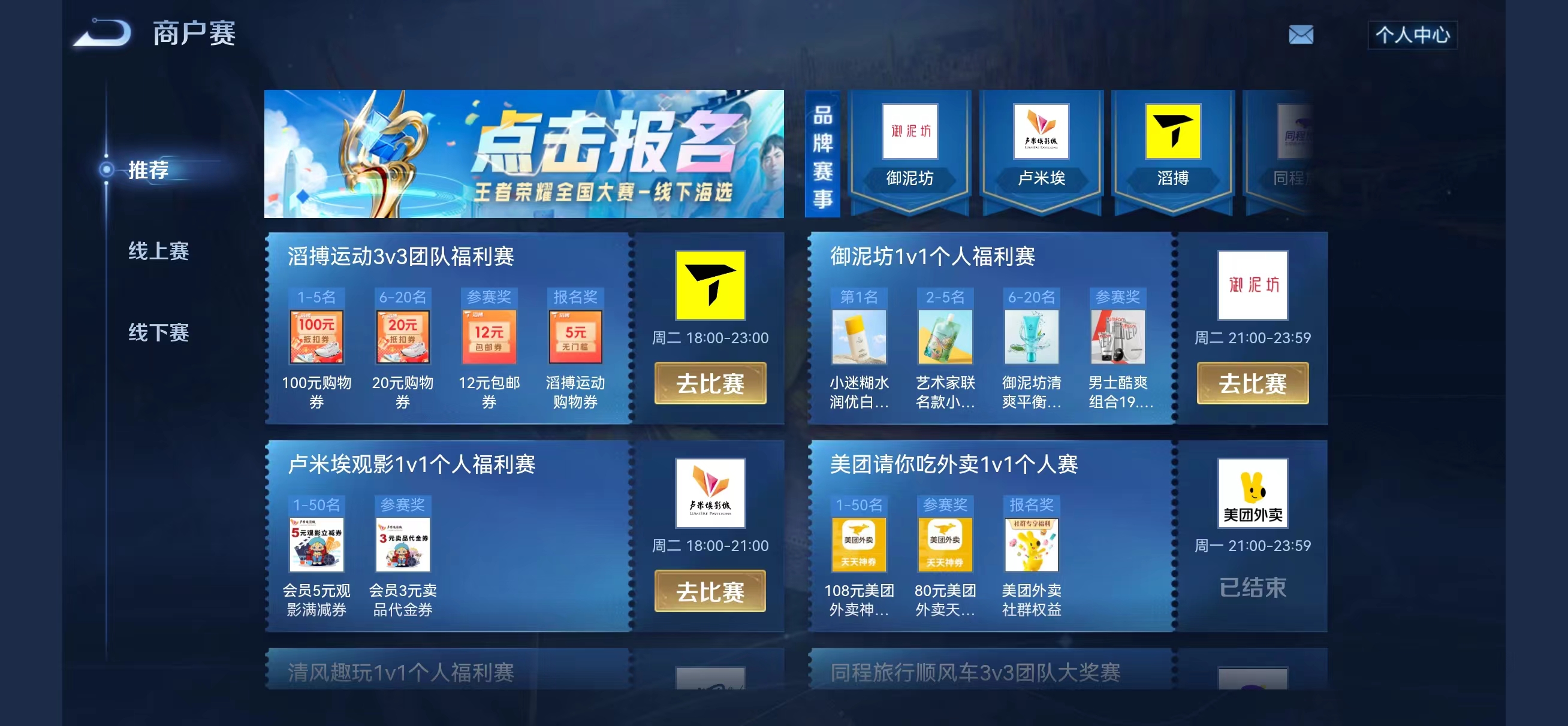
Currently, it has been used in King Saibao, HoK Club, Saibao Pro, peace events, high-energy events, merchant competitions and other projects.


# 4. How to use
- Install the
npmpackage
npm i press-plus
- Introduce and use it normally in the page
For example, the message-detail component:
<template>
   <PressMessageDetail />
</template>
<script>
import PressMessageDetail from 'press-plus/press-message-detail/press-message-detail.vue'

export default {
   components: {
     PressMessageDetail,
   }
}
</script>
- Configuration
You need to configure transpileDependencies in vue.config.js:
module.exports = {
   transpileDependencies: ['press-ui', 'press-plus'],
}
# 5. Contribution Guidelines
Please see here.