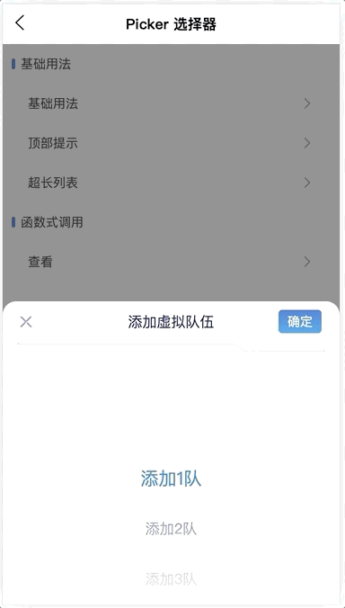
# PickerPlus 选择器
选择器组件,用于表单。
# 引入
import PressPickerPlus from 'press-ui/press-picker-plus/press-picker-plus.vue';

export default {
  components: {
    PressPickerPlus,
  }
}
# 代码演示
# 基本用法
示例
<press-picker-plus
  v-if="pickerOption.tip.show"
  :title="pickerOption.tip.title"
  :arrowIcon="pickerOption.tip.arrowIcon"
  :list="pickerOption.tip.list"
  :tip="pickerOption.tip.tip"
  :current="pickerOption.tip.current"
  @confirm="pickerOption.tip.confirm"
  @cancel="pickerOption.tip.cancel"
/>
export default {
  data() {
    return {
       pickerOption: {
        tip: {
          show: false,
          title: 'Ban位设置',
          tip: '创建比赛后,可按比赛轮次精确设置。',
          arrowIcon: false,
          list: bpList,
          current: { label: bpList[0].label, value: 1 },
          confirm: (boItem) => {
            this.pickerOption.tip.show = false;
          },
          cancel: () => {
            this.pickerOption.tip.show = false;
          },
        },
      },
    }
  },
  methods: {
    onShowPicker(type) {
      if (this.pickerOption[type]) {
        this.pickerOption[type].show = true;
      }
    },
    onConfirm(...args) {
      this.pickerOption[args[1]].show = false;
    },
    onChange(...args) {
      console.log('onChange.args', args);
    },
  }
},
# 函数式调用
支持函数式调用,需要在页面下预埋组件,并指定mode为functional。
<press-picker-plus
  :id="PRESS_PICKER_ID"
  mode="functional"
/>
export default {
  methods: {
     onShowFunctionalPicker() {
      const { bpList } = this;
      showFunctionalComponent.call(this, {
        selector: `#${PRESS_PICKER_ID}`,
        list: bpList,
        arrowIcon: true,
        current: { label: bpList[1].label, value: 3 },
        title: this.t('banSet'),
        tip: this.t('tipContent'),
      }).then((item) => {
        this.onSuccessTip(item);
      })
        .catch(() => {
          this.onTip('cancel');
        });
    },
  }
}
# 虚拟列表
对于数量大于virtual-list-threshold的列表,picker内部会使用虚拟列表。
实现原理是在picker-view上下各插入了一个占位Dom,并根据currentIndex计算它们的高度,同时将展示的数据减少。
<div
  :style="transformStyle"
>
  <div :style="hiddenUpPartStyle" />
  <div
    v-for="(item, index) in showingData"
    :key="index"
  >
    {{ item.label }}
  </div>
  <div :style="hiddenBottomPartStyle" />
</div>
export default {
  computed: {
    hiddenUpPartStyle() {
      const { currentIndex, itemHeight, virtualListThreshold } = this;
      return `height: ${(currentIndex - virtualListThreshold) * itemHeight}px;`;
    },
    hiddenBottomPartStyle() {
      const { currentIndex, data, itemHeight, virtualListThreshold } = this;
      return `height: ${(data.length - currentIndex - virtualListThreshold) * itemHeight}px;`;
    },
    showingData() {
      const { currentIndex, virtualListThreshold } = this;
      const upMissed = Math.max(0, currentIndex - virtualListThreshold);
      return this.data
        .slice(upMissed, currentIndex + virtualListThreshold).map((item, index) => ({
          ...item,
          uniqueKey: index + upMissed,
        }));
    },
    transformStyle() {
      const res = `transform: translate3d(0, ${this.currentScroll}px, 0);`;
      return res;
    },
  }
}
# API
# Props
| 参数 | 说明 | 类型 | 默认值 |
|---|---|---|---|
| title | 标题 | string | - |
| arrow-icon | 左上角是否显示为返回箭头 | boolean | false |
| list | 数据列表,每一项为对象,需包含label、value | array | [] |
| current | 当前选中项 | object | null |
| tip | 提示 | string | - |
| mode | 函数式调用时传functional | string | - |
| virtual-list-threshold | 触发虚拟列表的最小数量 | number | 50 |
# Events
| 事件 | 说明 | 返回值 |
|---|---|---|
| cancel | 点击取消 | - |
| confirm | 点击确定 | - |
以下为废弃属性(v0.7.32):
| 类型 | 旧 | 新 |
|---|---|---|
| Prop | show-back-arrow | arrow-icon |
| Prop | select-list | list |
| Prop | select-item | current |
| Event | onClickConfirm | confirm |
| Event | onRemove | cancel |
# 在线调试
# 常见问题
# 虚拟列表对比
下面是picker有8000项时的对比,左图是未使用虚拟列表,右图是使用虚拟列表。