[toc]
# 1. 开始
暗黑模式总体上是通过css变量实现的,给其一套不同的面板即可。
使用者只需要修改html的theme-mode属性:
// 设置暗色模式
document.documentElement.setAttribute('theme-mode', 'dark');
// 重置为浅色模式
document.documentElement.removeAttribute('theme-mode');
# 2. 文档示例
由于模式切换是放在组件里的,没有事件抛出来,开发者如何监听呢,如何在示例iframe中拿到当前的模式呢?
可以用MutationObserver。
function watchHtmlMode(callback = () => {}) {
  const targetNode = document.documentElement;
  const config = { attributes: true };

  const observerCallback = (mutationsList) => {
    for (const mutation of mutationsList) {
      if (mutation.attributeName === "theme-mode") {
        const themeMode = mutation.target.getAttribute("theme-mode") || 'light';
        if (themeMode) callback(themeMode);
      }
    }
  };

  const observer = new MutationObserver(observerCallback);
  observer.observe(targetNode, config);

  return observer;
}

function changeIframeMode(mode){
  const iframe = document.querySelector('iframe');
  if (!iframe?.contentWindow) return;
  iframe.contentWindow.document.documentElement.setAttribute('theme-mode', mode);
}

export default defineComponent({
  mounted() {
    watchHtmlMode(changeIframeMode)
  }
})
iframe初始化的时机不定,可以在mobile iframe初始化时,在内部对自己进行mode的设定。
export default defineComponent({
  mounted() {
    this.initIframeMode();
  },
  methods: {
    initIframeMode() {
      const parent = window.parent;
      if (!parent) return;
      const mode = parent.document.documentElement.getAttribute('theme-mode') || 'light'
      document.documentElement.setAttribute('theme-mode', mode);
    }
  }
});
# 3. token 使用
下面是官方给出的 token 使用指南。
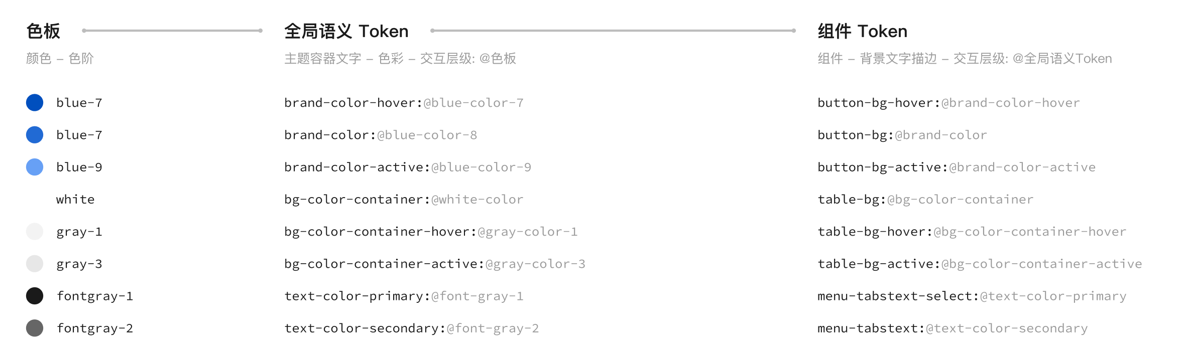
全局语义token是组件无关、色值无关的变量,可以当作不同模式的“中间层”。
下面是这次暗黑模式中常用的token。
| 变量 | light 名称 | dark 名称 | light 值 | dark 值 | 说明 | 使用场景 |
|---|---|---|---|---|---|---|
text-color-primary | font-gray-1 | font-white-1 | rgba(0, 0, 0, .9) | rgba(255, 255, 255, .9) | 文字-主要 | - |
text-color-secondary | font-gray-2 | font-white-2 | rgba(0, 0, 0, .6) | rgba(255, 255, 255, .55) | 文字-次要 | - |
text-color-placeholder | font-gray-3 | font-white-3 | rgba(0, 0, 0, .4) | rgba(255, 255, 255, .35) | 文字-占位符/说明 | - |
text-color-disabled | font-gray-4 | font-white-4 | rgba(0, 0, 0, .26) | rgba(255, 255, 255, .22) | 文字-禁用 | - |
text-color-anti | - | - | #fff | #fff | 文字-反色 | - |
text-color-brand | brand-color-7 | brand-color-8 | #0052d9 | #4582e6 | 文字-品牌 | - |
text-color-link | brand-color-7 | brand-color-8 | #0052d9 | #4582e6 | 文字-链接 | - |
bg-color-page | gray-color-1 | gray-color-14 | #f3f3f3 | #181818 | 页面底层背景 | 示例背景色 |
bg-color-container | white-color-1 | gray-color-13 | #fff | #242424 | 主要容器背景 | tab-bar-bg-color |
bg-color-secondcontainer | gray-color-1 | gray-color-12 | #f3f3f3 | #2c2c2c | 次要容器背景 | tab-item-tag-bg |
bg-color-component | gray-color-3 | gray-color-11 | #e7e7e7 | #383838 | 组件背景 | button-default-bg-color |
component-stroke | gray-color-3 | gray-color-11 | #e7e7e7 | #383838 | 组件分割线 | action-sheet-gap-color |
component-border | gray-color-4 | gray-color-9 | #dcdcdc | #5e5e5e | 边框 | back-top-round-border-color |
# 4. 例子
看下面的代码:
.t-drawer__sidebar-item {
  color: var(--td-drawer-title-color);
}
没有默认颜色,优化下:
// _variables.less
@font-gray-1: var(--td-font-gray-1, rgba(0, 0, 0, .9));

// var.less
@drawer-title-color: var(--td-drawer-title-color, @font-gray-1);

// index.less
.t-drawer__sidebar-item {
  color: @drawer-title-color;
}
上面代码引入了组件token(@drawer-title-color)和语义token(@font-gray-1)实现默认颜色,组件 => 组件变量 => 通用变量,@drawer-title-color => @font-gray-1。
但仍然无法实现暗黑模式,再次优化下:
// dark.less
:root[theme-mode="dark"] {
  --td-font-white-1: rgba(255, 255, 255, 90%);
  --td-text-color-primary: var(--td-font-white-1);
}

// _variables.less
@font-gray-1: var(--td-font-gray-1, rgba(0, 0, 0, .9));
@text-color-primary: var(--td-text-color-primary, @font-gray-1);

// var.less
@drawer-title-color: var(--td-drawer-title-color, @text-color-primary);


// index.less
.t-drawer__sidebar-item {
  color: @drawer-title-color;
}
增加--td-text-color-primary,组件 => 组件变量 => 通用变量 => 不同模式CSS变量。
@drawer-title-color => @text-color-primary => @font-gray-1。
@text-color-primary这个名字是颜色无关、组件无关的,可以用来换肤。
# 5. 小结
主题替换,主要是一些color、background-color、border-color的替换,需要有良好的、统一的设计规范。